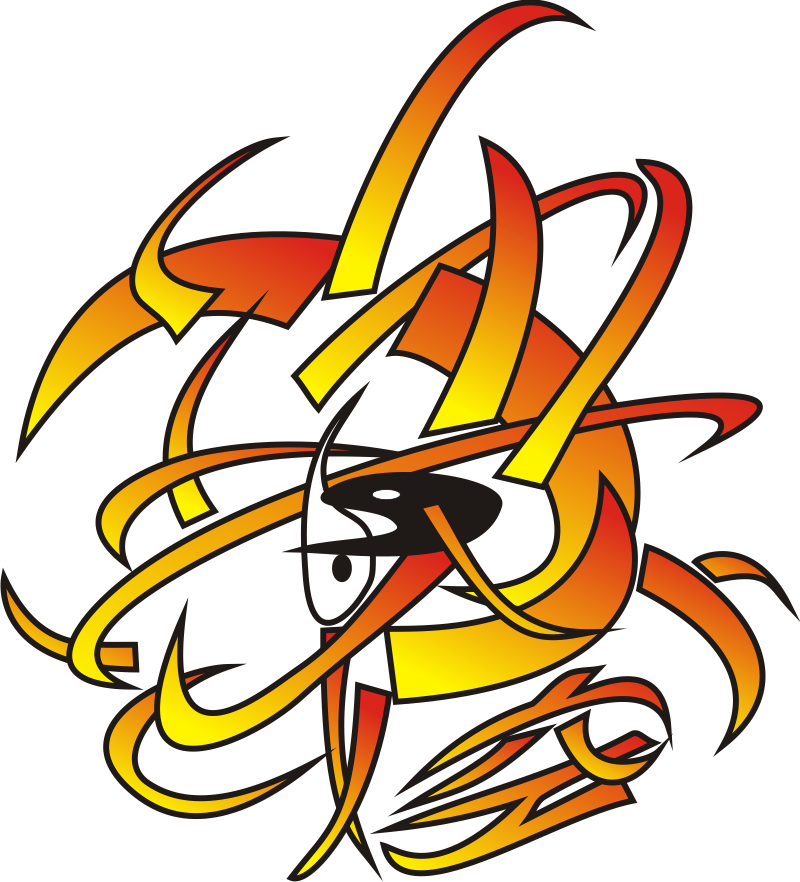
You already saw this Logo at the starting page that I made myself and I use it as my general logo for my “brand”. This is actually a good example, as it was first drawn per pencil, then I digitized it, I even vectorized it and then colored it digitally. (But it was also done a long time ago, and I would make it different now). Don’t ask me what this is in detail, some of my designs have a lot of depth and hidden meanings, and this one has also a few sources of inspirations and new meanings for me.
What you probably see is the Yin-Yang symbol in the middle. But in my version it is free floating around each other – so the flux of yin and yang (which is usually two-dimensional) is even more in flux here in three dimensions. One other element you might notice is the japanese kanji at the lower right: 空. It is spoken “kara”, you might know the word from the term “Karate”. “Kara” means empty (e.g. “kara te” means “empty hand”), void or in a more philosophical approach (taken loosely from “The Book of Five Rings” by Miyamoto Musashi) it symbolizes the moment of perfect balance between all the other elements in a person – or you could probably say a state of “Zen”. The other elements are chaos.
The colors are more easily explained: I used to wear a lot of yellow and orange clothes, and I still use it a lot in my bows and arrows and other equipments or accessories.
That is where I stop to explain, and you can think what that means. But it shows how a lot of my more personal art is to be read.
Galleries
Some of my latest designs in a few assorted galleries. I will add more and more of my work, as I curate it and come around to it.
Various Logos for my clubs:
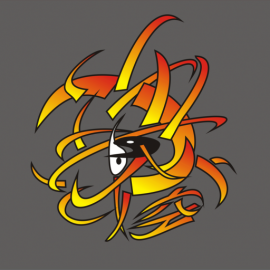
 The Logo of AHS Bogensport, our universities archery club. The figure is Artemis – the goddes of the hunt. In the background you see the six colored ribbons in a circle, which is the logo of AHS Stuttgart. And I used one of the ribbons as the bow.
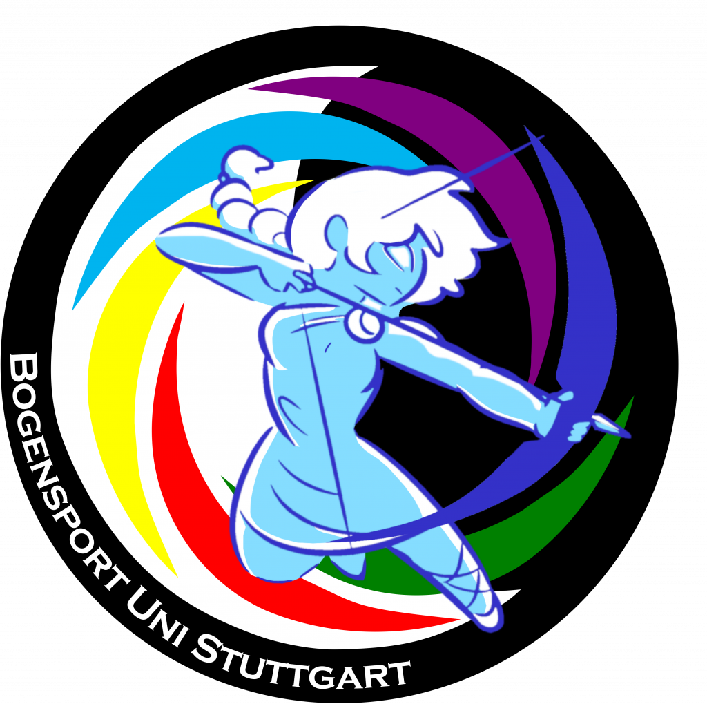
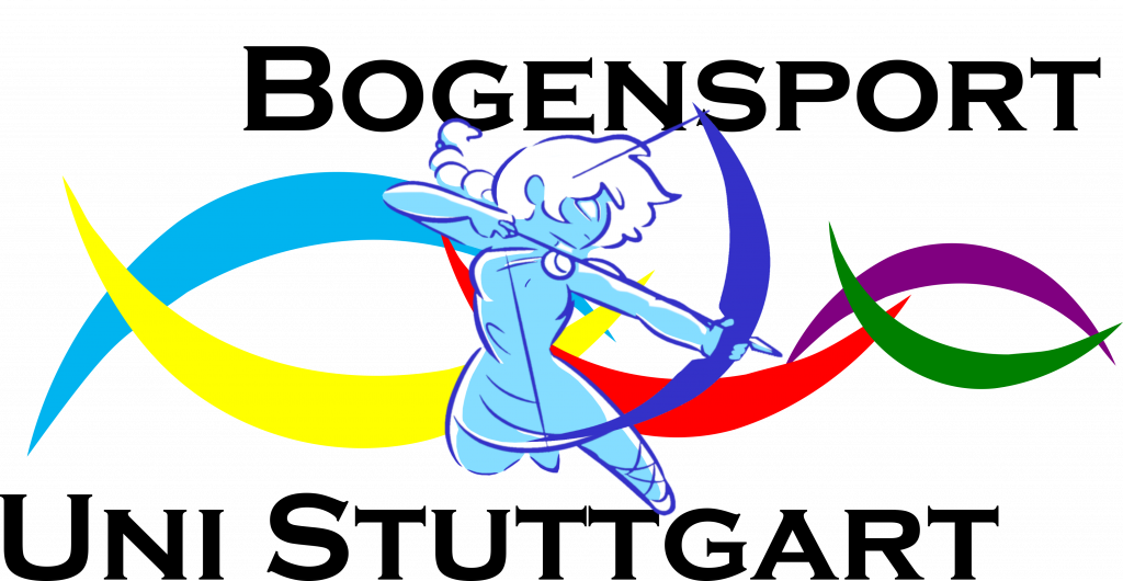 The Logo of AHS Bogensport, a light small version for the front of the jersey. As you can see, I broke oben the circle to break out of the circle and get more of a nametag feel.
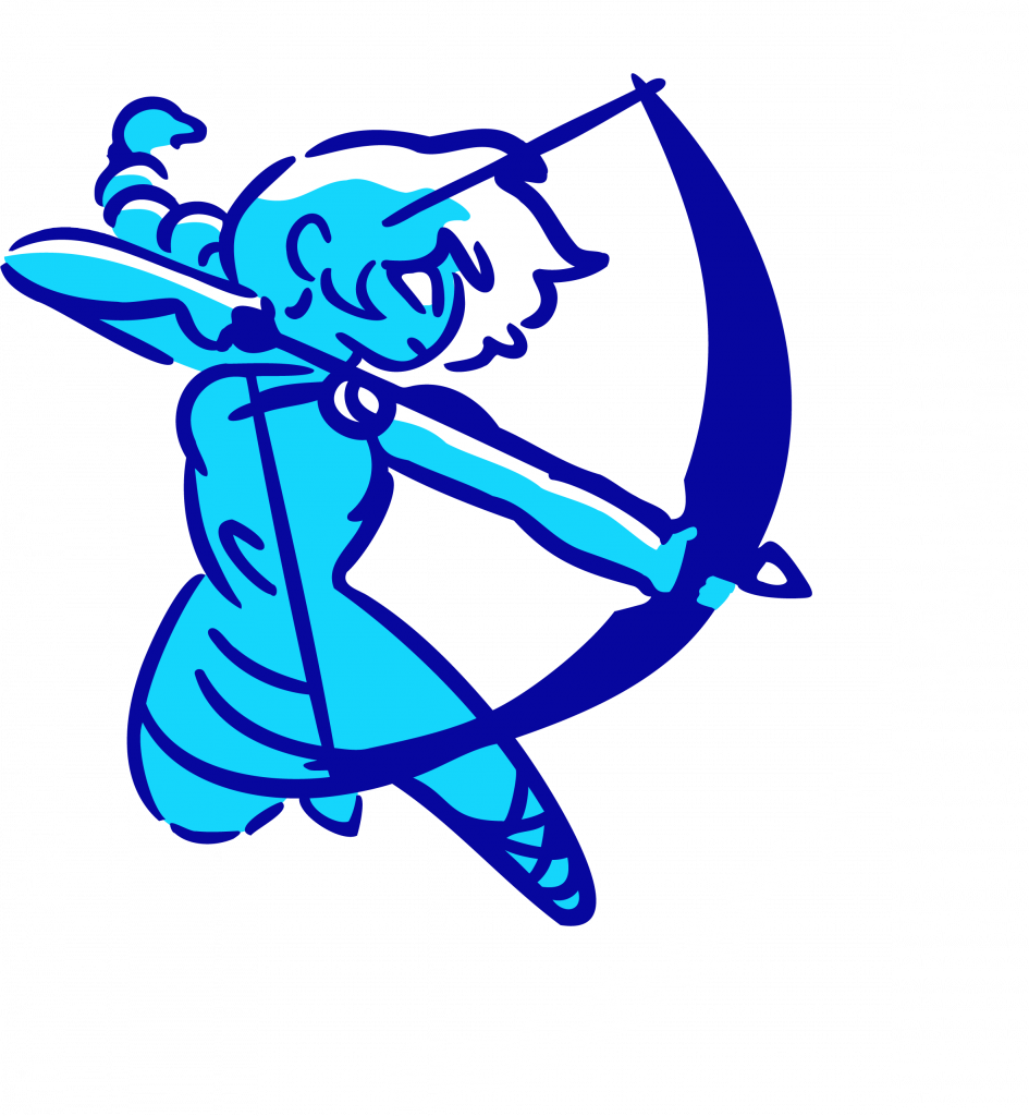 The Logo of AHS Bogensport,. This version was due to the restrictions of the stitching process, but I like it now, and it is more simple. Here you see, that I heavily edited the source. I vechtorized it, cleaned it, recolored it, fixed a few mistakes (the source has two right hands…). I put in a lot of hours now.
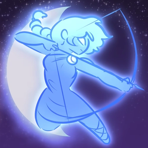 This is the source material. This was not done by me and I want to credit the artist, where credit is due. I saw this fantastic YouTube Video by https://www.youtube.com/@OverlySarcasticProductions and loved this version of Artemis. So I tried to contact them and reach them somehow, but I never got a response. I will never use this commercially, nor earn a single cent on it, so I hoped it will be ok, if I use it as the logo for our University Archer Club. Please watch their videos!
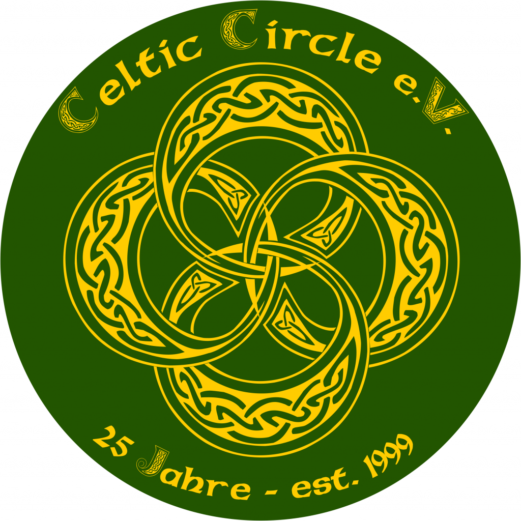 The 25 year Logo of my RPG Club Celtic Circle e.V.- I used a letter from the font CeltMD, vectorized and, heavily edited it into circles, et voilà.
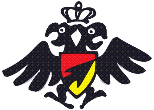 The Logo of my medieval archery club Schützen vom Schloss (Castlearchers is our “normal” archery club name). This was a collaboration with another club member.
Tattoo designs in various stages:
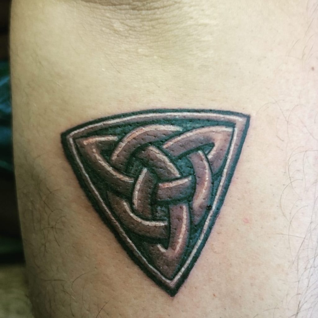 This is my 2nd tattoo, on my skin. 2017, Tattoo Heroes, Dublin, Ireland.
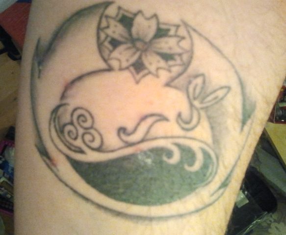 This is my first tatto in its finished state. 2013, Lucie, now at Villa Bunter Hund, Tübingen, Germany.
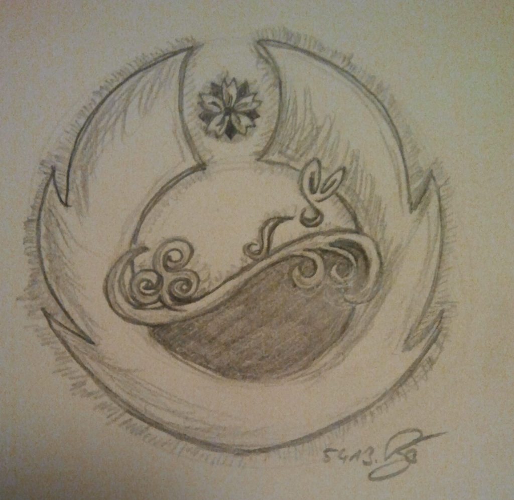 The final design of my 1st Tattoo. Jedi symbol flames with standin sakura for the star, yin yang in the middle, also doubling as hill and moon behind it, the rabbit more stylized on top of the hill in from of the moon, the trinity became a mix of clover and tree, I build in waves at the end of the wavy line. the wayvy line is actually inspired by the symbol of the tv series Heroes. and the Sakura is made into a japanese mon, with blades as leaves. 2013.
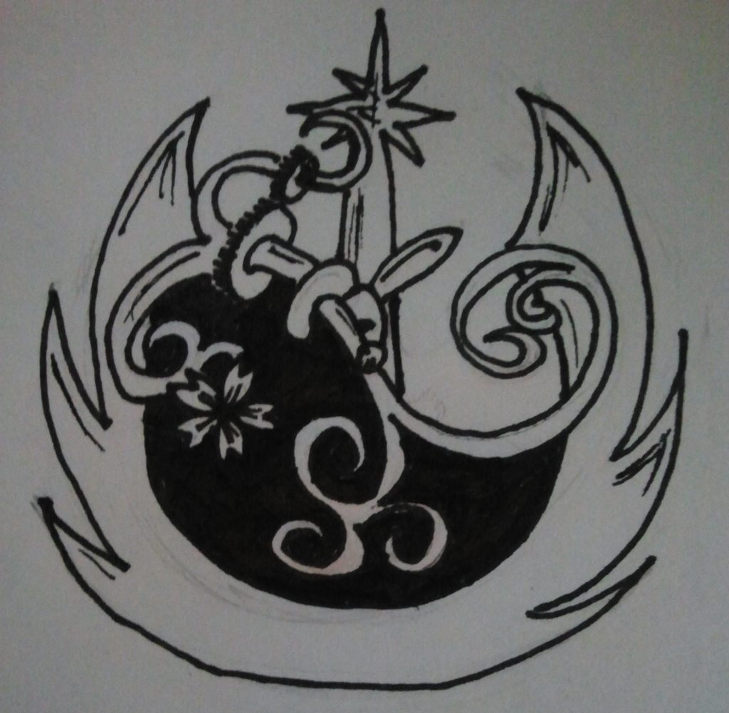 One of the pre-designs leading to my 1st Tattoo. Already getting to the end-result, encircling the Jedi symbol, the celtic trinity, the japanese sakura, the hidden rabbit, the hidden yin-yang, some steampunk cogs.
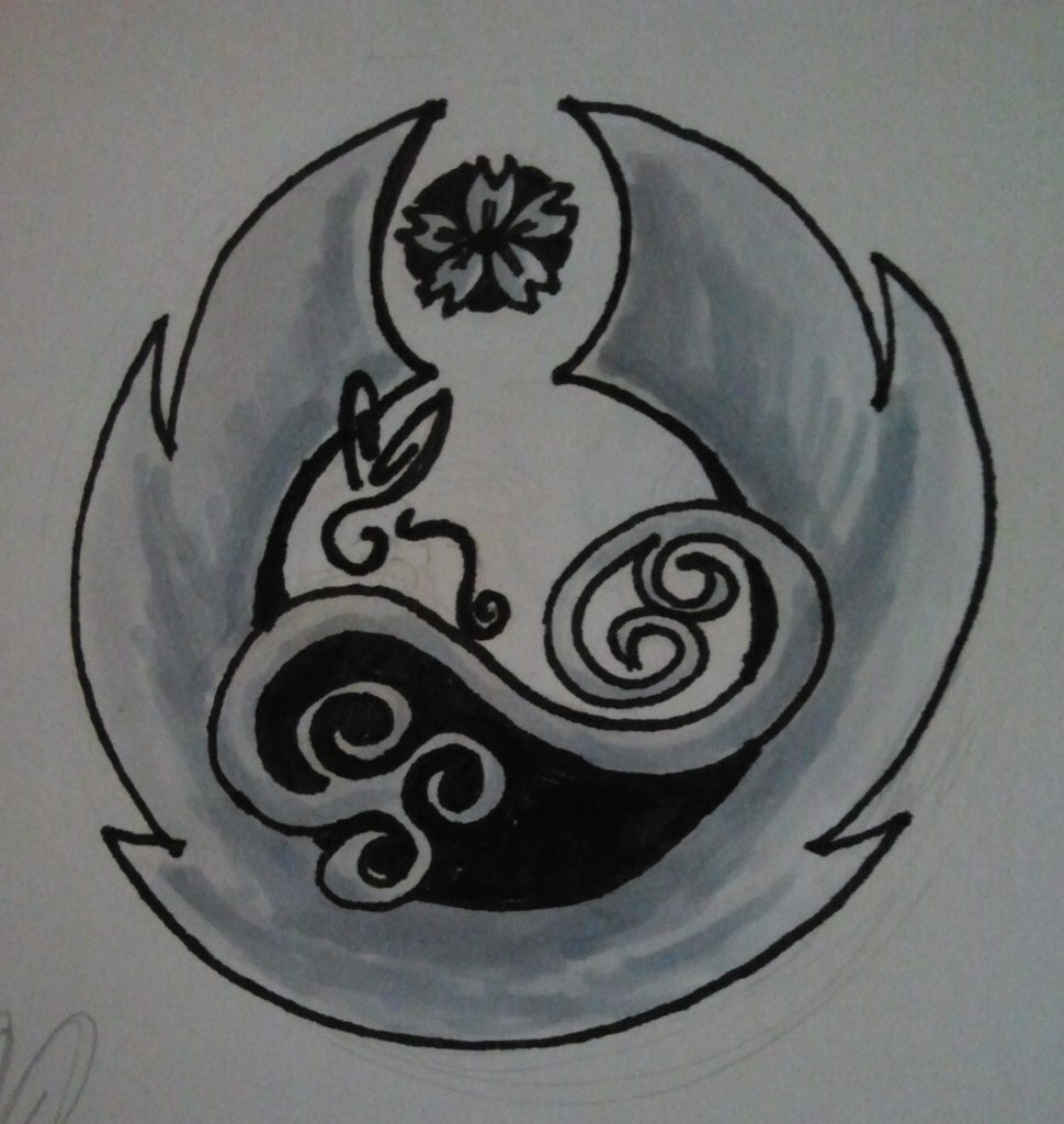 One of the pre-designs leading to my 1st Tattoo. This is pretty much the end-result, I flipped it. From the Jedi symbol only the “flames” stayed, and the sakura stands in as the star.
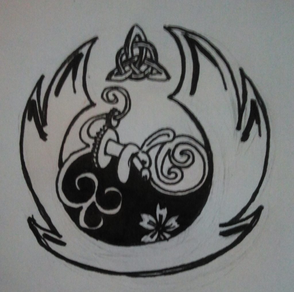 One of the pre-designs leading to my 1st Tattoo
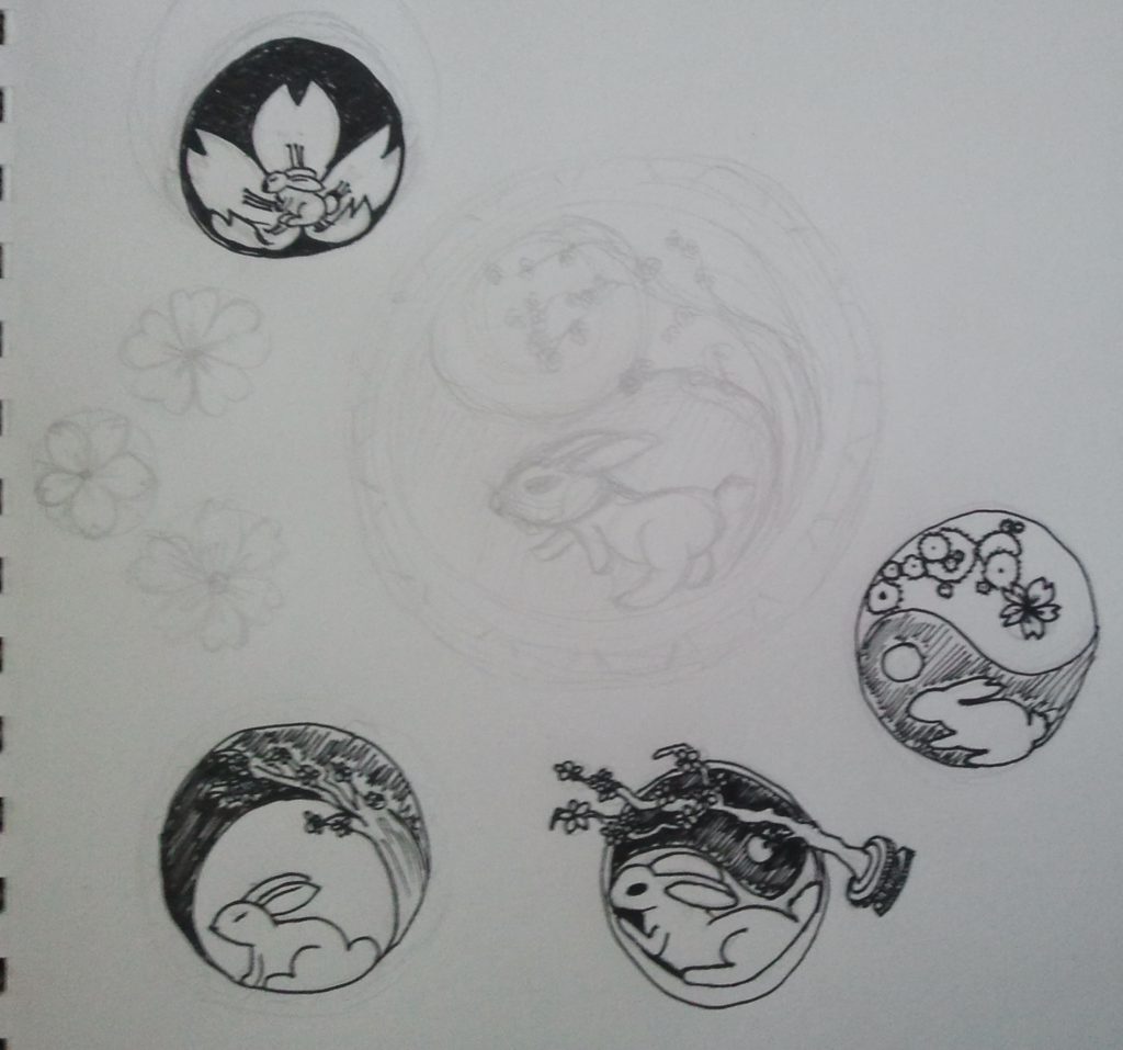 Some of the pre-designs leading to my 1st Tattoo- You see the origin of my idea here, a classical japanese painting of the Rabbit before the full moon, the sakura blooms.
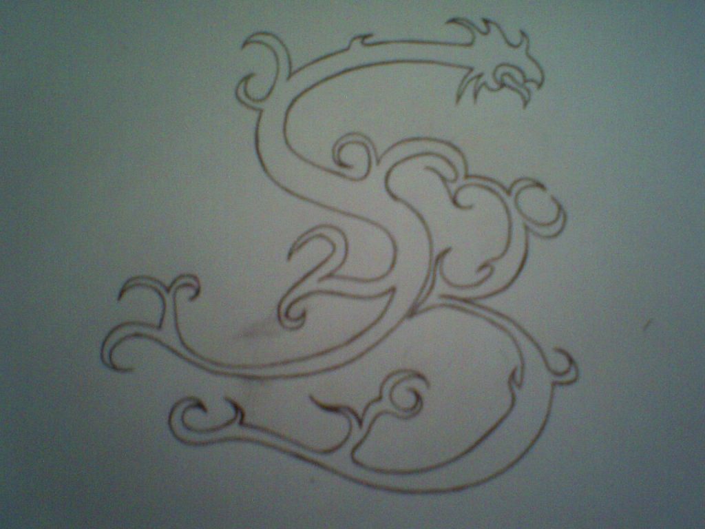 A design sketch for a possible tattoo for a friend. Letters of his nicks initials. I think this ended up as a logo on his website.
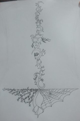 A design sketch for a possible tattoo for a friend. Meant to go up the length of the whole spine
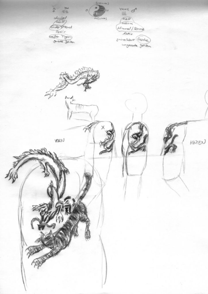 This is one of my earlier tattoo ideas I had, to do on my right shoulder and shoulder blade. Tiger and Dragon. On top you see some of my notes to it even. 2001